
Key Takeaways
In a team, built a prototype for a Homebuyer’s Guide within the Wells Fargo app that would help first-time homebuyers navigate the process
I created diagrams detailing the app organization after our redesign, in addition to creating sketches and wireframes at varying levels of fidelity; our process was very collaborative
The complexity of the homebuying process and the Wells Fargo app/site’s confusing hierarchy were major challenges
To address these, we built flows for several tools within the feature: a checklist, an affordability calculator, and a glossary.
I proposed a calendar tool that would tie into the checklist and help users keep track of where they were in the homebuying process; no competitor currently has an equivalent tool. We chose not to build it out due to time constraints.
Background
Wells Fargo’s mobile app has resources available to make navigating the homebuying process more digestible for first-time buyers.
These tools are difficult to access. Most information on the mobile app relevant to homebuying requires leaving the app for the mobile site, adding unnecessary friction for the user. The site’s layout is another hurdle, with content buried under layers of menus and in multiple locations.
Other issues related to the process are not exclusive to Wells Fargo; even in the best-case scenario, purchasing a home is a Herculean undertaking dotted with jargon.
The Problem
Users need better access to information and tools related to the processes of:
determining if they’re ready to buy a home
purchasing a home
maintaining a home
Proposed Solution
Our team determined that creating a dedicated homebuying guide with several organizational tools like a checklist would make users more comfortable in navigating the homebuying process.
Research
Our team had no prior knowledge of the homebuying process. With two weeks to go from concept to working prototype, we also had little time to waste. To better orient ourselves, we looked at a few competitors’ offerings in terms of how they explain the homebuying process
Bank of America's desktop site orients users in the broad strokes of the process, but isn’t very helpful once they actually begin looking for a home.

Another competitor included a checklist functionality. We decided to differentiate by making it a core component of the experience. I proposed adding a calendar with an alert functionality that would tie directly into the checklist, with key milestones being automatically added depending on when users wanted to complete the process.
We conducted user interviews after collaboratively writing pre-screeners and interview questions. Users confirmed what we already suspected – the process of purchasing a home is overwhelming.

Many users wished they had been more prepared for the complexity of the homebuying process. Help from a qualified individual was also considered important, as were external tools such as multiple listing services (MLS) and Zillow.
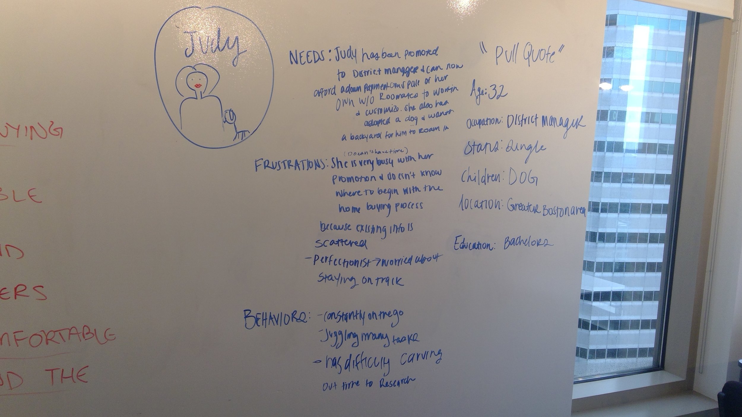
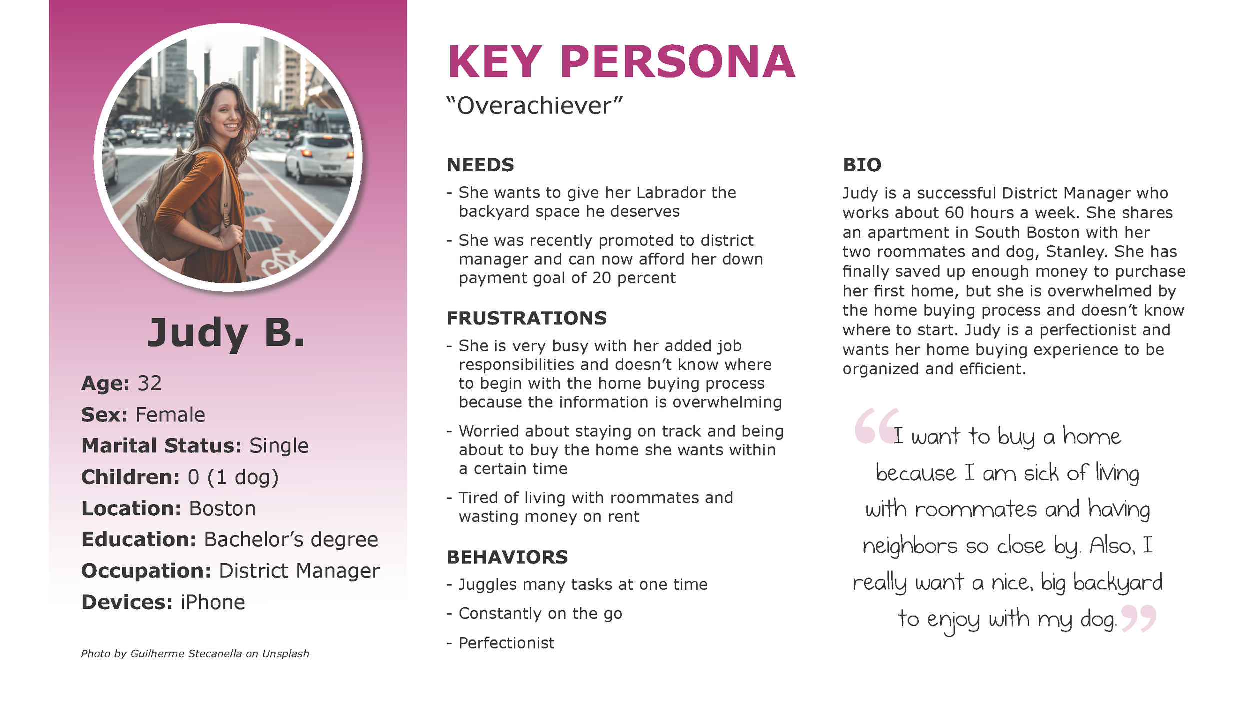
With these trends laid out, we created personas of our expected users. These personas reflect our users’ desire to stay on task with the homebuying process while juggling the responsibilities of daily life.
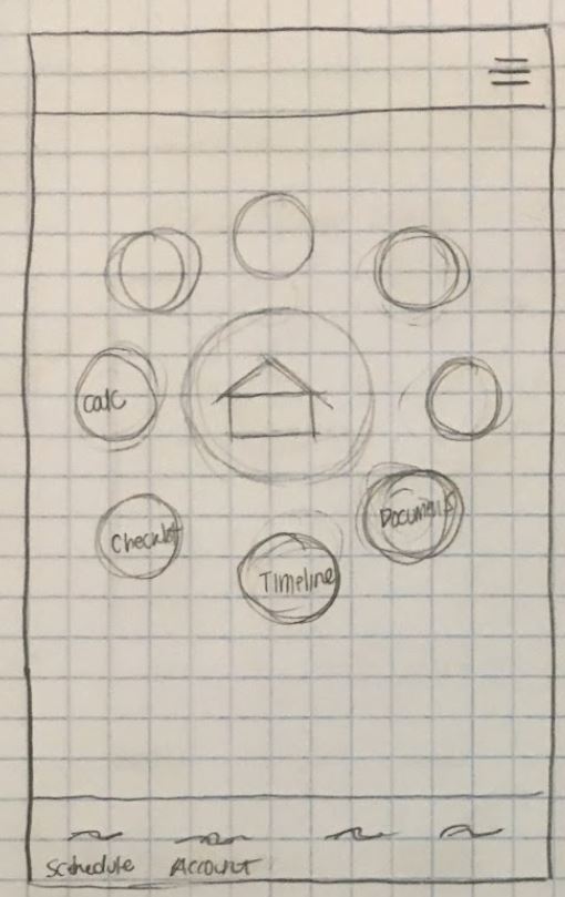
Initial Sketching
The Design Studio methodology helped us act quickly and decisively. We designed independently after determining a shared goal, then convened to discuss what worked and what needed improvement in each designer’s approach. With this feedback in mind, we made adjustments to our designs before meeting once more to settle upon a final design.
Site Organization
Click to enlarge.
A colleague laid out the existing hierarchy of information of Wells Fargo’s app and website, which helped us identify the problems we previously noted in the existing site. We were also able to identify which content was repeated multiple times throughout the site, indicating parts of the homebuying process that Wells Fargo deemed important.
Testing and Iteration
My designs are in the top-right. Click to enlarge.
Once we built out screens for a paper prototype, our next step was to test them with users. To guide the process, I wrote a set of tasks for users to complete. After making adjustments based on feedback from the rest of the team, we felt ready to put our creation to the test…
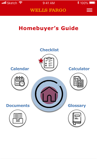
…and we quickly discovered the flaws in our design. We had made some major assumptions regarding how users would navigate the product which turned out to be incorrect. The tools available in our Homebuyer’s Guide are organized in a dashboard, with the most important one (the checklist) being placed on top.
One participant professed their bewilderment in our ordering of items in the checklist. Likewise, they did not proceed to our stated first step on the checklist, an affordability calculator.

An early iteration of the affordability calculator's results screen. Each adjustable slider is also listed as a discrete screen to fill out in prior steps.
We took that feedback into account when building our next iteration of the product, this time in Sketch. Our group divided the work; I built the footer and a popup notification explaining the term “prequalification”. I also collaborated with a colleague in adjusting the dashboard screen based on their original concept used in the paper prototype.
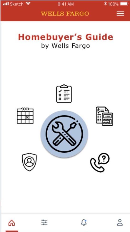
Displayed above are Iterations of the dashboard, from earliest sketch to final prototype. If the user wants more information on a given step in the checklist, they can bring up the popup shown below. I built the below medium-fidelity (not final) screen in Sketch.

The next round of testing unearthed a fresh set of problems in our screens that were less apparent in paper prototyping. As the Homebuyer’s Guide was conceived as a new feature in an existing app, we adhered very closely to the existing home screen. This led to some confusion regarding the presence of a login field. We had also hidden the Homebuyer’s Guide within the “hamburger” menu in the top right, which made finding the feature somewhat unintuitive despite indicators of its presence once the user opened the menu.
User Flows and Final Iterations
A mapping of the different tools in our final prototype, and where/how users can access them. I built this in Axure.
We took a step back to determine if we were truly looking at the priorities of our personas. In order to make sure we could achieve this goal, we made some adjustments to the steps a user could take throughout the product, which I then built out in Axure. In illustrating the information architecture, I considered how the Homebuyer’s Guide would slot into the existing Wells Fargo mobile app and how different features would interact together.
I built this detailed view of the paths a user can take through the affordability calculator in Axure. Note the ability to skip earlier screens and multiple ways out of the calculator.
With an adjusted user flow and a rapidly approaching deadline, we took stock of what we could feasibly build and what had to be cut. As such, I had to let go of my calendar concept – while we all agreed on its usefulness as a differentiating feature, it would have been a huge time investment to make sure it was properly integrated into the rest of the prototype. We wanted to drill down on what we were already improving upon – the checklist.
As such, we reframed the process of using the checklist from "doing" to "learning" – related activities for each step can be completed optionally, but the user only had to read the information in a step before moving on.
Our last round of testing helped further refine the affordability calculator, allowing us to fix or replace elements that were unclear.